SEO - Get your site noticed!
Not only is this template beautifully designed but it is great for search engine optimization as well! What is SEO? It is simple the act of altering a web site so that it does well in the organic, crawler-based listings of search engines such as google.com. How does this template accomplish this? It's simple, the majority of your most valuable content is found in the main body of your site, through css we are able to alter the layout of the site and call the main content before the left and right columns are called. This allows for your content to be found first by search engines before it reaches your other content, which is vital in search engine optimization. This is a common feature this can be done with almost all of Shape 5 templates as well.
The S5 Tab Show can be demo'd at the bottom of this page. This version of the module is customized specifically for this template and cannot be used with any other templates. We do have another version that can be used on any Joomla template.
The module holds up to 10 actual module positions so you can publish any of your favorite modules to one of the slides and keep your site clean and consolidated while giving it some eye candy. So simply publish the s5 tab show module to your desired module position and pages. Then start publishing modules to the positions in the tab show (s5_tab1, s5_tab2, etc); these modules will become the slides.
This menu system works off of the core Joomla jquery/mootools scripts so no extra javascript library is needed and keep download sizes to a minimum. Also, if you do not want to use this menu you can simply turn it it off from the template configuration page.
Take your website to the next design level by using the robust and feature rich S5 Flex Menu System. Organize your links with ease and show content in places you never could before!
Menu Features:
- Automatic onclick functionality for tablet sized touch screens. If a device's screen is detected as touch screen and is of table size, then the menu will function with an onclick method rather than the onmouseover effect that is shown on a laptop or desktop that has a mouse for use.
- Multiple javascript effects such as fade, slide, etc.
- Multiple columns for menu items or modules.
- Modules load directly into the menu.
- Group sub menu items into the same column or fly out.
- Optional sub texts for each menu item.
- Optional menu icon images for each menu item.
- Automatic multi-language menu change. If you are setting up a multi-language site, the flex menu will automatically change if your site's visitor has a language specific menu setup for their language in the menu manager.
- And much more!
Menu Screenshot:

This module is shown on this page just above this text. The frontpage display module is a great way to attract customers and organize your content, and best of all it's fully responsive! It consists of one main display area and 2-9 boxes below that control the main display area that can be split into multiple rows. The main content area and boxes are fully customizable by allowing to you specify your own images, sizes, hyperlinks and much more to adapt to any template! Setup is very easy, by simply supplying images for the top area, background images for the boxes, and your own custom html for each box.
Features at a glance:
- Fully responsive width and bottom boxes.
- Responsive re-distribution. Configure the bottom boxes to re-size at your own specified page widths.
- Fading transition.
- Width of boxes (set individually).
- Margins of both top and bottom area.
- Show between 2 and 9 boxes, that can be split into multiple rows.
- Set the background position and repeat of each box.
- Choose to cycle the boxes automatically or manually.
- Choose the display time.
- Use any image for the boxes and top area.
- Create hyperlinks for the boxes or top area.
- Open hyperlinks in a new window or same window.
- Insert your own HTML code.
Note - If the responsive layout is enabled the drop down will disable when the screen size reaches 750px so that it does not interfere with the mobile menu bar

- Customize almost everything! Shadows, borders, gradient, opacity
- Contains 6 module positions drop_down_1, drop_down_2, drop_down_3, drop_down_4, drop_down_5 and drop_down_6
- Auto adjust to the height of your content
- Set your own open and close text
- Auto collapse if no modules are published to it
- And many more features!
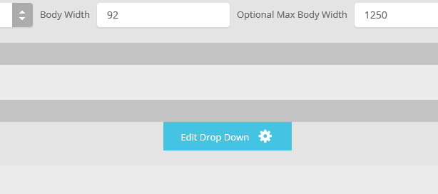
Screenshot of Drop Down admin in template configuration area: